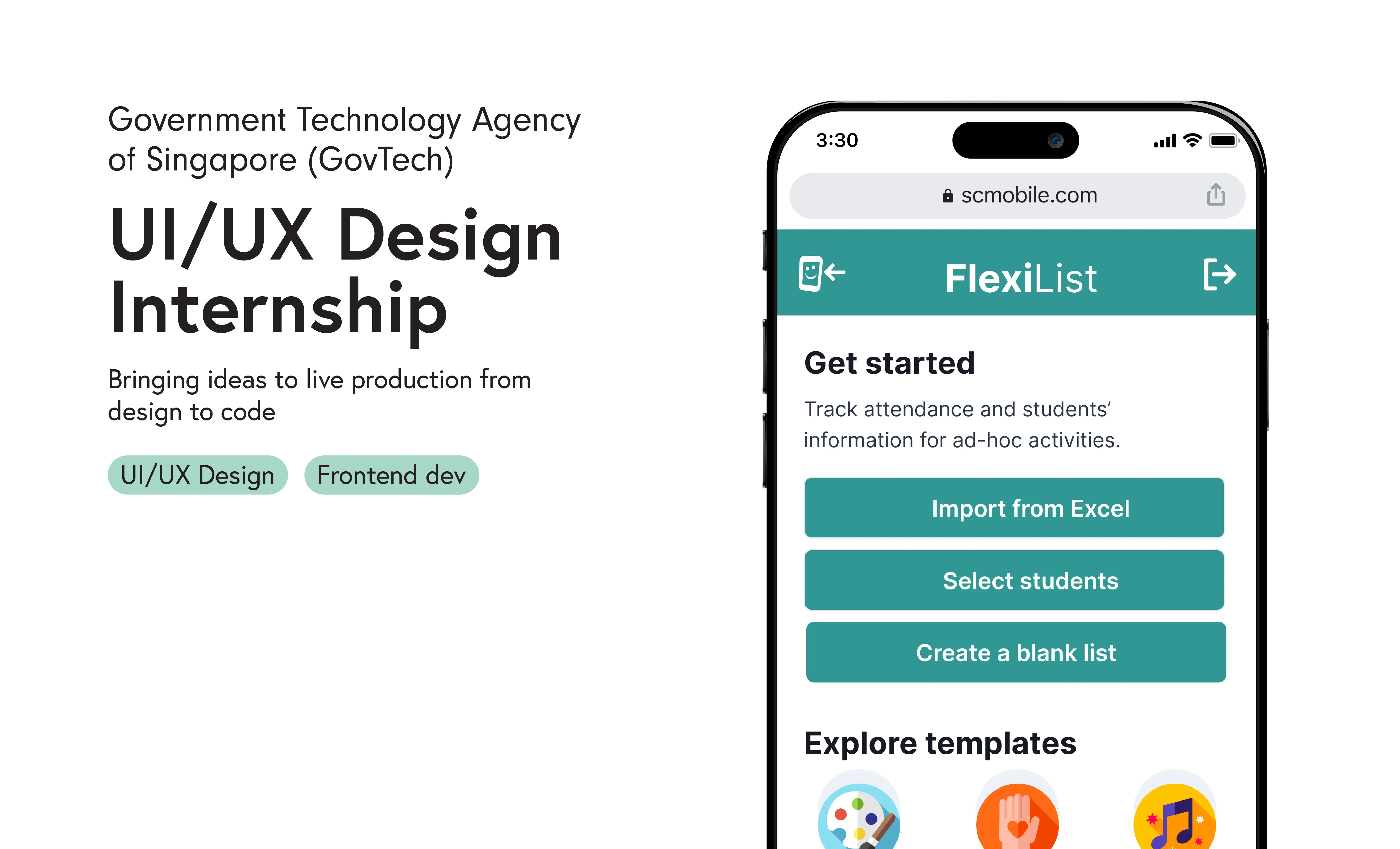
Dashboard of activities
I directly contributed to live projects during my internship, gaining hands-on experience in bringing ideas from concept to implementation.
To comply with my non-disclosure agreement, all confidential information including user quotes have been obfuscated or omitted from this case study.
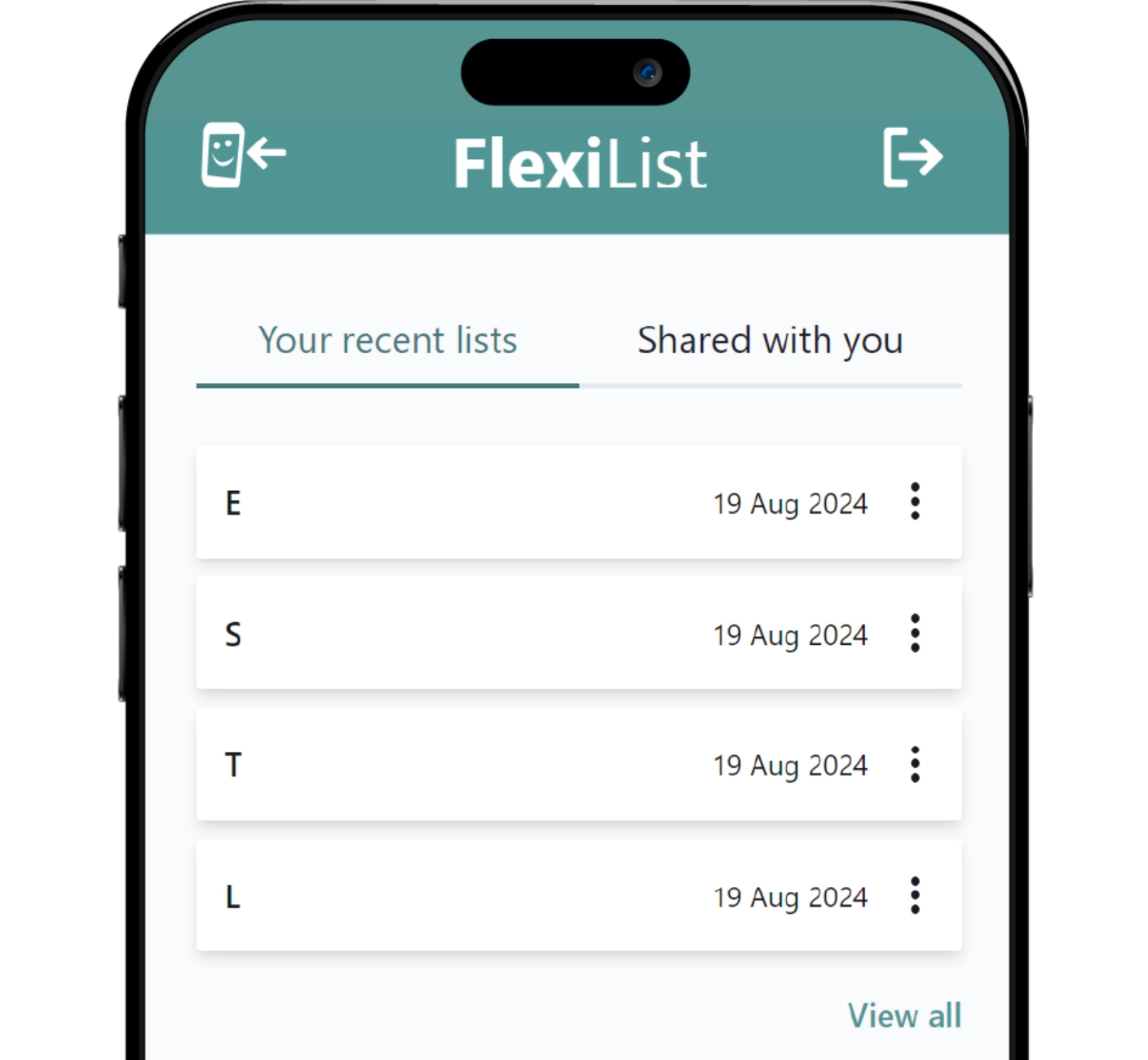
What is Flexilist?
An official-use custom student name list web app:
- Mobile friendly for easy access on the go
- Collaborate with other teachers in real-time
- Syncs directly to our national student database
Project Timeline
In an increasingly data-driven world, how could we enhance FlexiList to encourage a data-driven approach in schools?
Research
1. Research
Consolidate and analyze existing user research
User Interview
2. User Interview
Gather new info to guide project & design direction
UI/UX Design
3. UI/UX Design
Prototyping designs and user testing
Frontend Development
4. Frontend Development
Implement designs and push to production
#1
Research
Do teachers benefit from easier access to data? To answer this question, I summarized 2 years worth of past research in Dovetail, before narrowing down to the Trend Analysis use case.
#2
User Interviews
How do teachers currently use data?
a.k.a. What features should we build to encourage a data-driven approach?
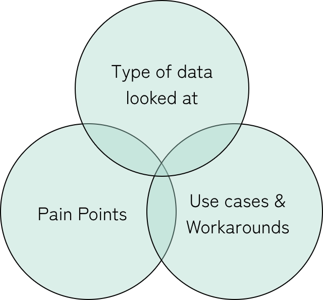
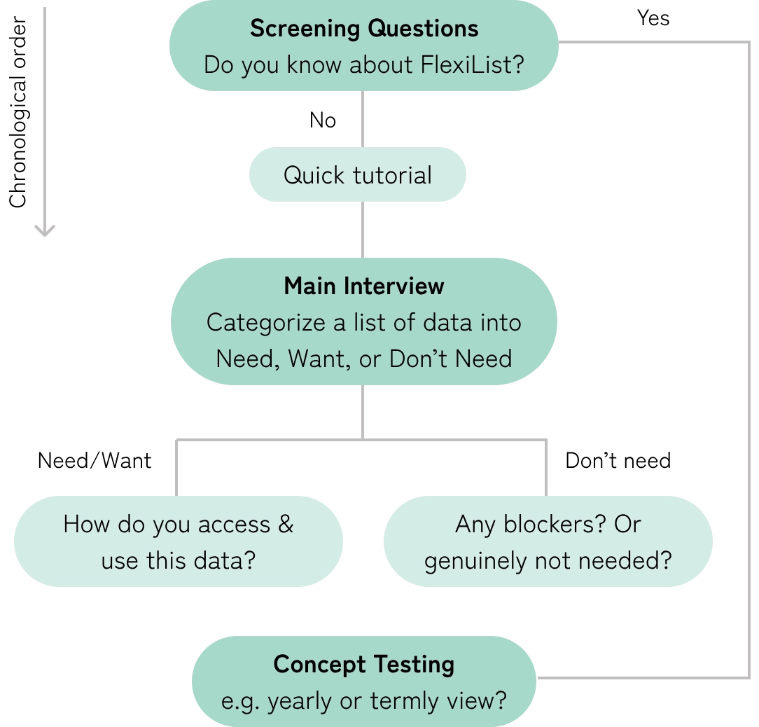
User Interviews #1 Findings
Audience: Regular Teachers
They were only concerned with data types that directly impacted their day-to-day operations. e.g. attendance, dietary needs
“Do I need this data to deliver the lesson? No. I just need to make sure I teach well. It would be extra work to collect and look at the data.”— Math teacher, Primary School (Grade 1-6)
* quote obfuscated due to NDA
User Interviews #2
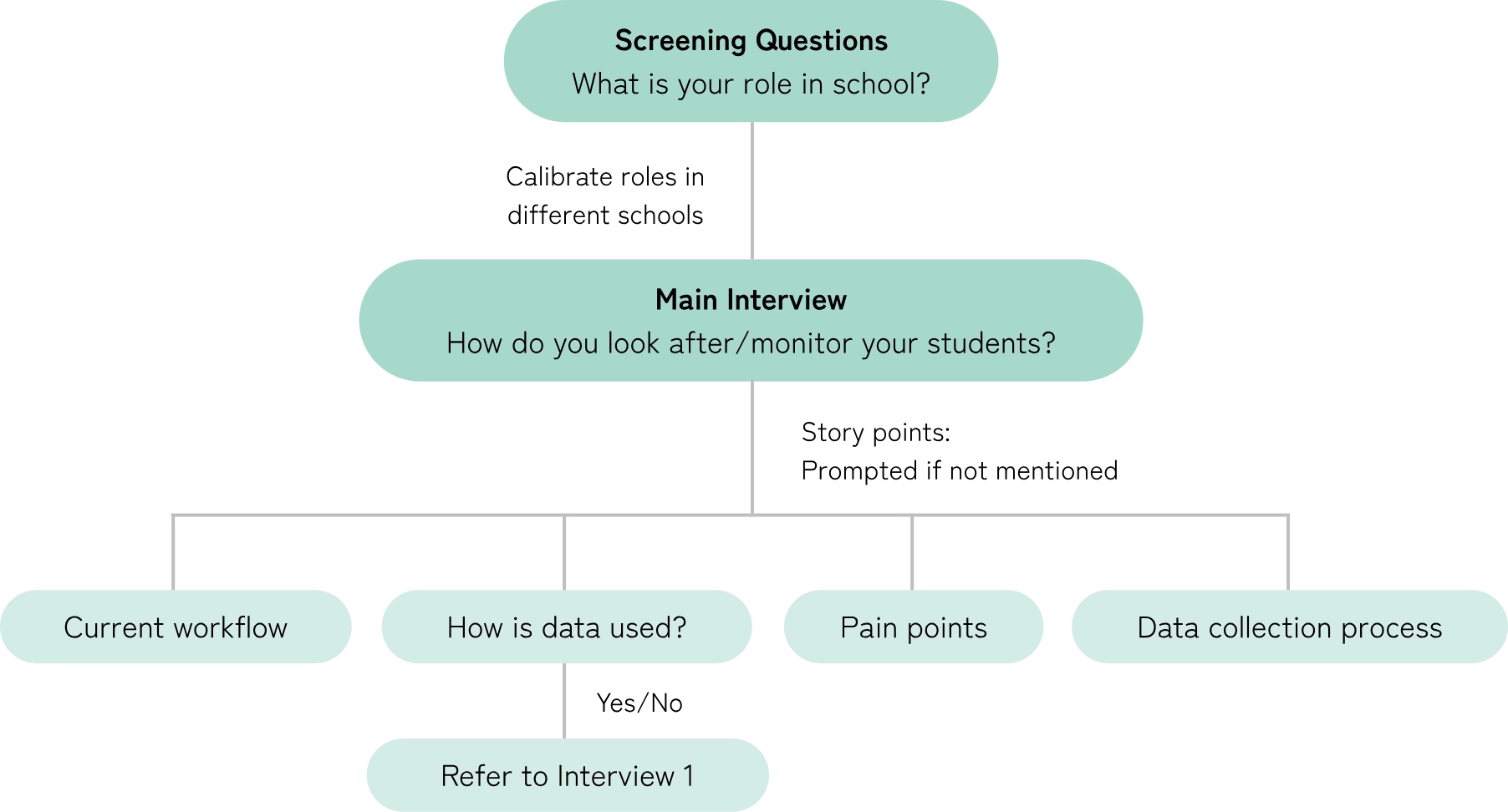
Audience: Key Personnel (KP)
i.e. teachers who were middle management and above. Data analysis is typically part of their job.We knew these teachers used data extensively. To minimize the priming effect present in Interview 1, I crafted a controlled conversation with flexible story points instead of chronologically-ordered questions.
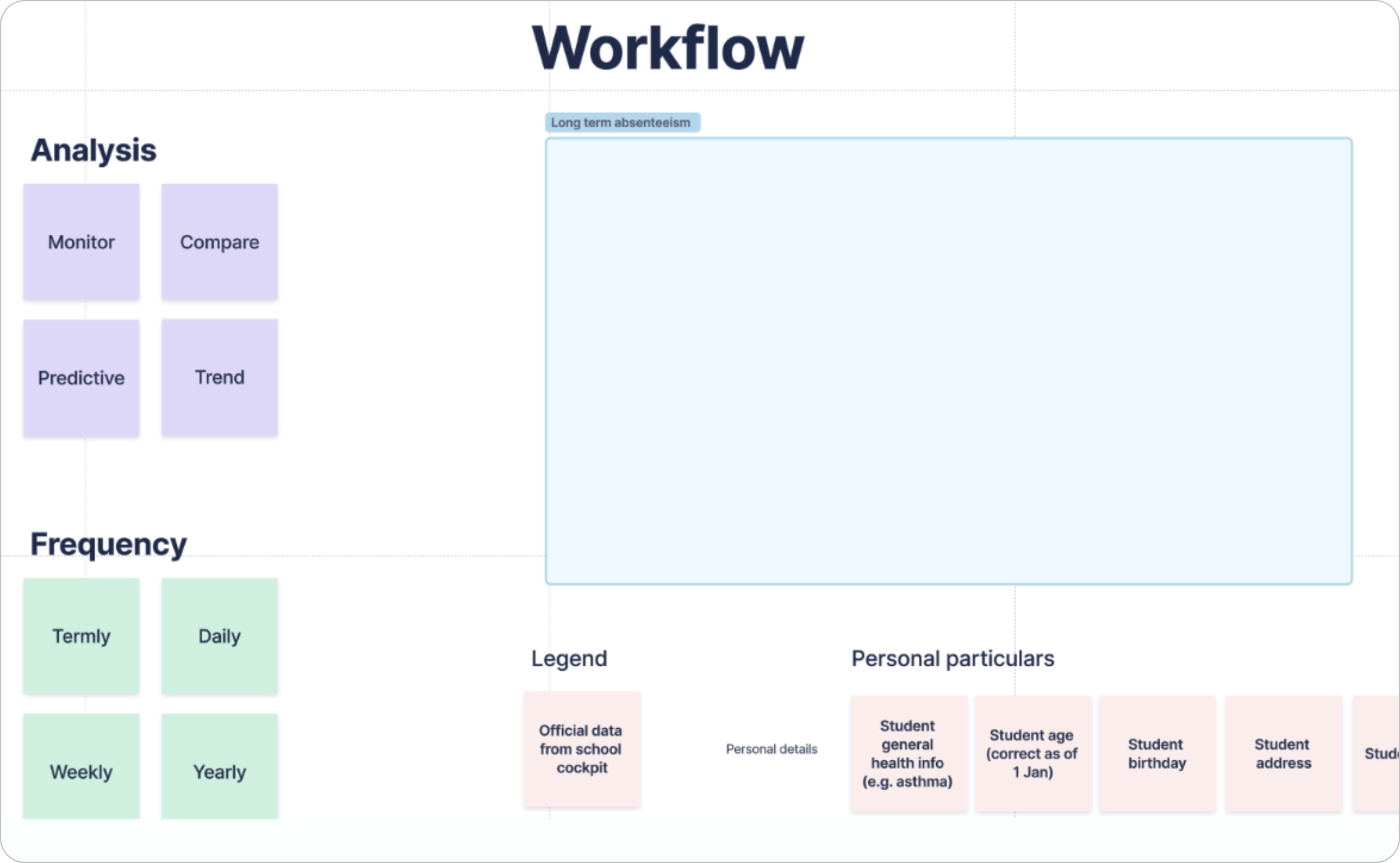 Planned to take down visual notes while interviewee talks about their workflow, but didn’t follow through as I couldn’t multitask D:
User Interviews #2 Findings
Naturally, these teachers were excited about incorporating more data usage, providing clear insights into its benefits.
With this confirmation, we could go ahead with feature development.
#3
UI/UX Design
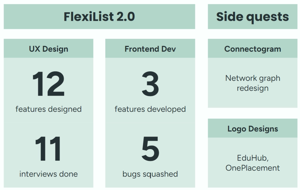
As the only designer in the team, I designed and oversaw 12 features. 7 features have been released to live production with 2 features in the backlog.
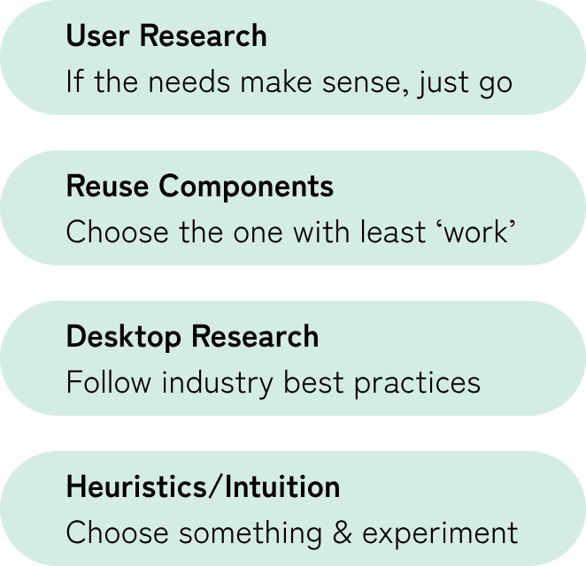 Iterative design process
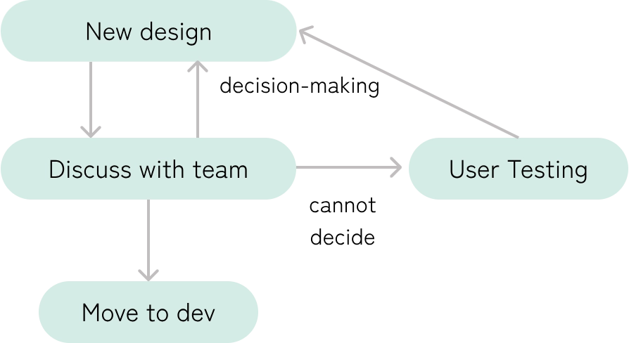 Decision making matrix
Case Study: Just-in-time Feedback
We released many features in a short period of time and wanted to know how our users felt.
We previously sent out long forms, but those were rarely filled in. Even if it was, it's an unsustainable amount of information to analyze on our end.
Functionality
We want quantitative and qualitative feedback from users at the lowest feedback processing cost.
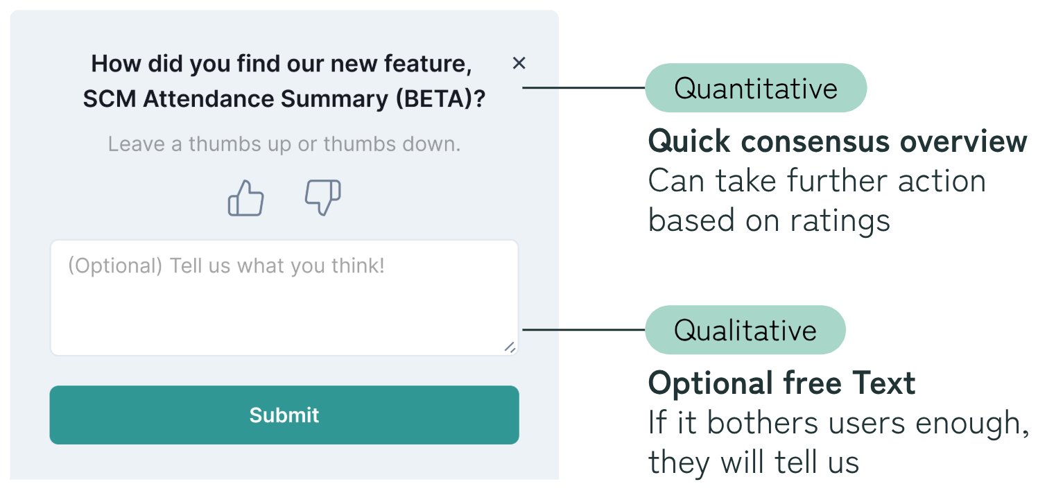 Version 1: Purely functional pop-up design
Usability
However, users aren't the happiest about giving feedback, especially when it's a pop-up. It interrupts their task and doesn't provide immediate value.
The solution?
“Trick” users by reducing the cognitive load of the pop-up without sacrificing functionality.
Break into 2 steps
Wow so short and easy

After they click a rating
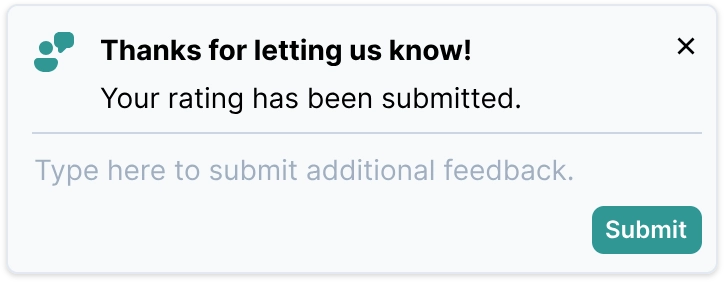

Final Design
Balance Functionality & Usability
In Version 2, users can't backtrack to edit their rating in case of a misclick. Considering that it's not critical to hide the already selected binary rating system, I opted to retain it as part of the extended bottom sheet so that users can still edit their selection.
 Bottom sheet: Pre-selection thumbs up/thumbs down (quantitative)
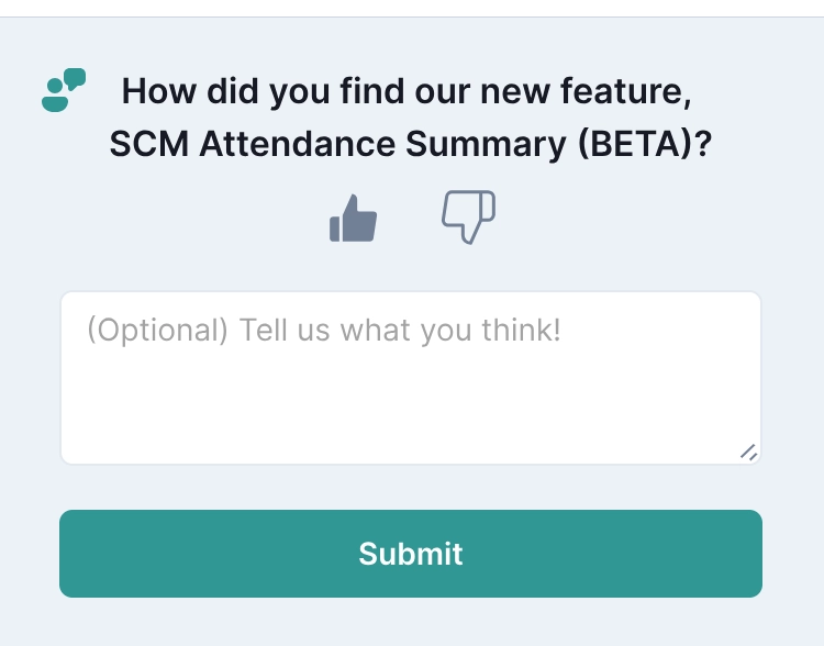 Bottom sheet: Post-selection thumbs up/thumbs down (quantitative) with free-text section (qualitative)
Usability Heuristics Analysis
- Visibility of system status
- User control and freedom
- Error prevention
- Recognize, diagnose, and recover from errors
#4
Front-end Development
I pushed to production 3 features and 8 bug fixes. Wearing two hats leads to larger opportunities, especially since I’m developing my own designs.


Slowly Progressed In Difficulty
To familiarize with the codebase/tech stack:
- Started with simple bug fixes
- Extended existing features
- Finally building my own feature
 First pull request!
 Final feature built from scratch
Overall, my contributions received positive user feedback!
"With the new features (including add dropdown selection), I can conduct an item and error analysis of a student cohort much more easily."— Math teacher, Secondary School (Grade 7-10)
* quote obfuscated due to NDA
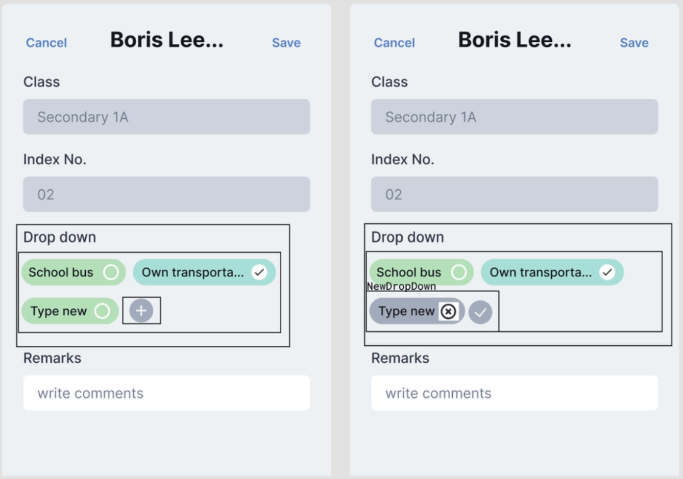 Behind-the-scenes: Laying out the 'Dropdown selection' component architecture for React development
And there's more!
These are just glimpses of the many interdisiplinary learning moments I had during my internship. Let's connect if you'd like to hear more about my experience!
#5
Reflection
I'm incredibly grateful for this opportunity; I never thought that I could explore both fields of Design and Computer Science in one internship.
While I'm excited to continue honing my skills, I'm eager to push my limits as an interdisciplinary professional e.g. serve as a communication bridge between the two fields. I cannot wait to explore further!
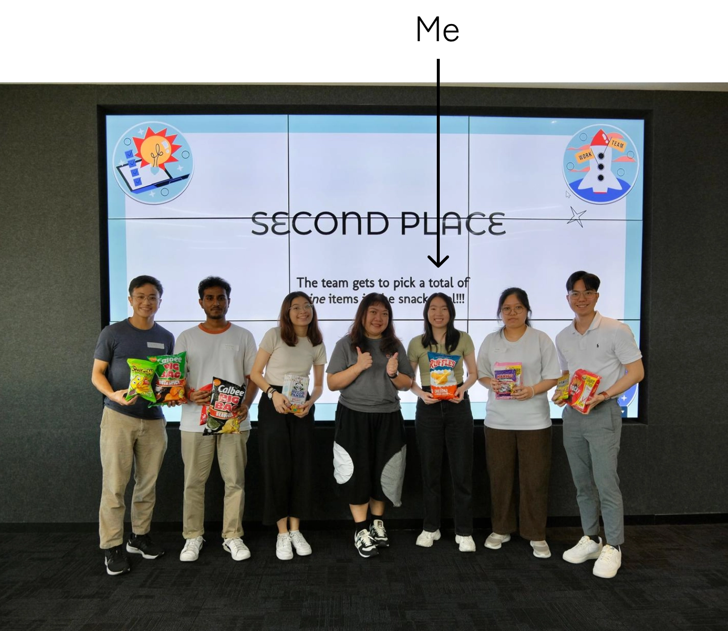 Led a team with no prior UX experience to secure second place in our UX-themed intern hackathon!